Weingut Reumann
About:
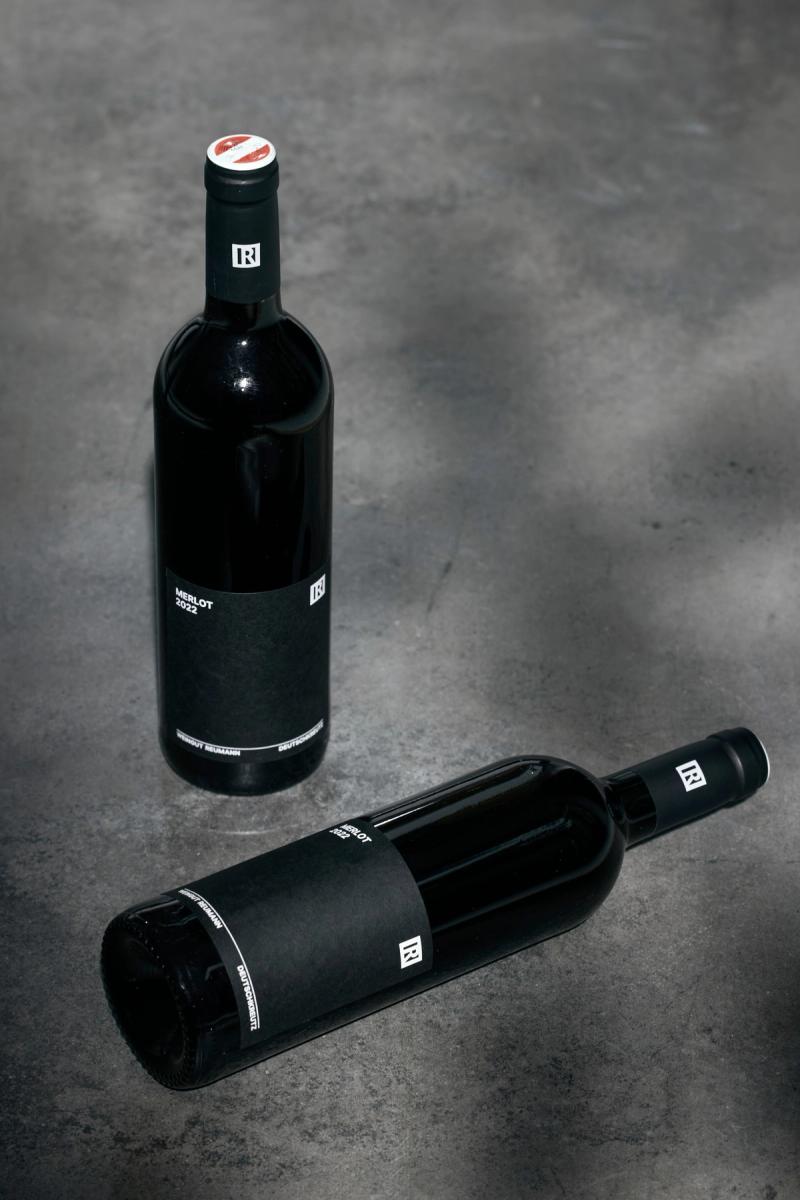
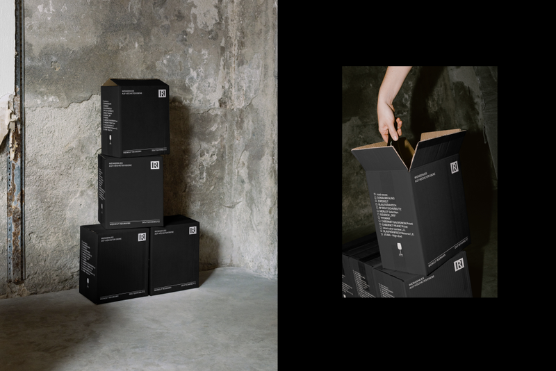
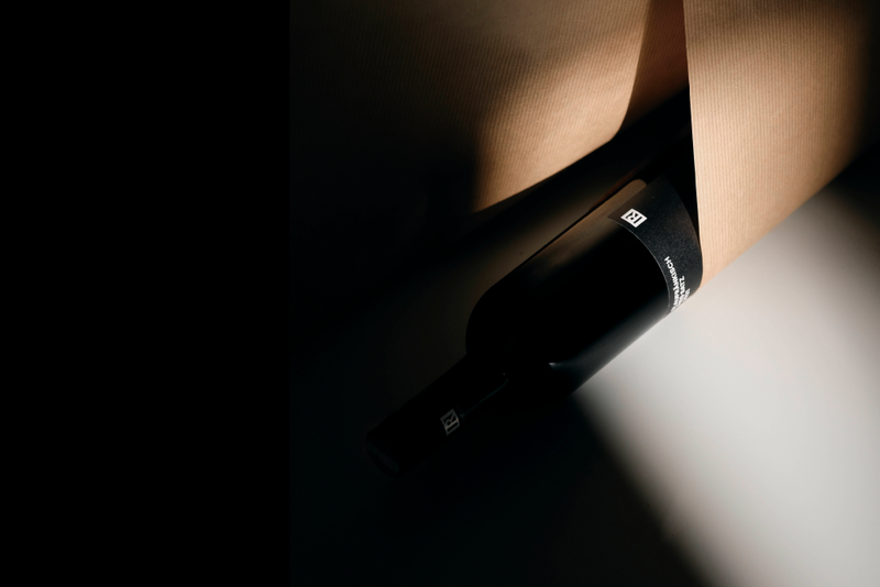
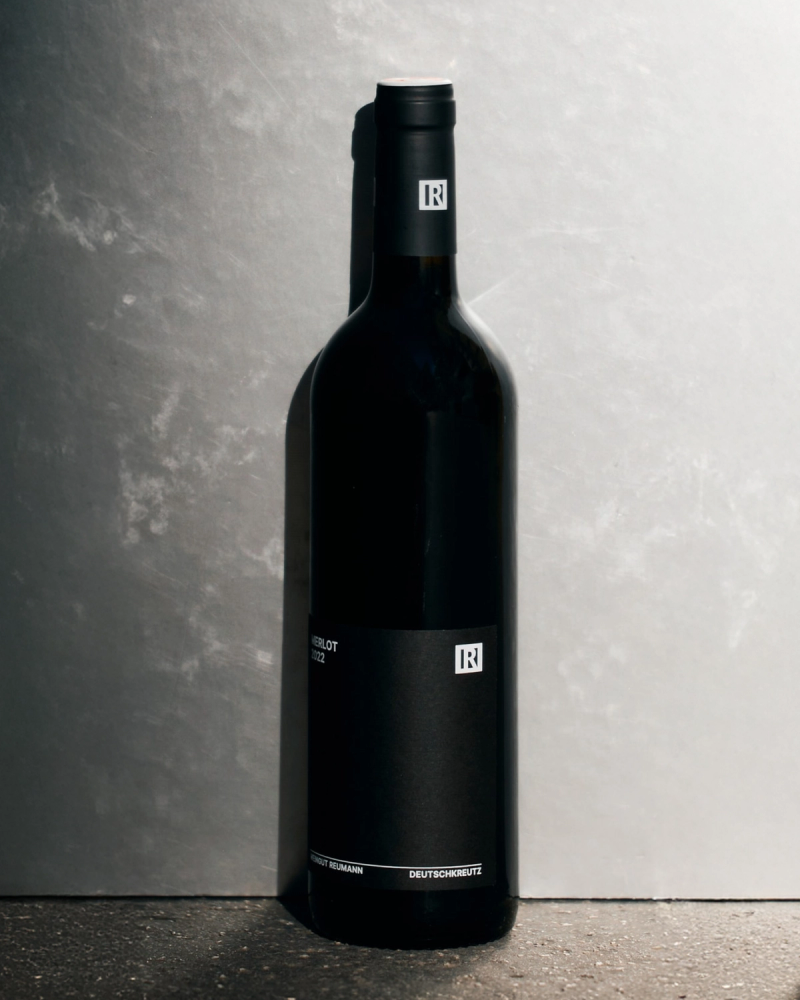
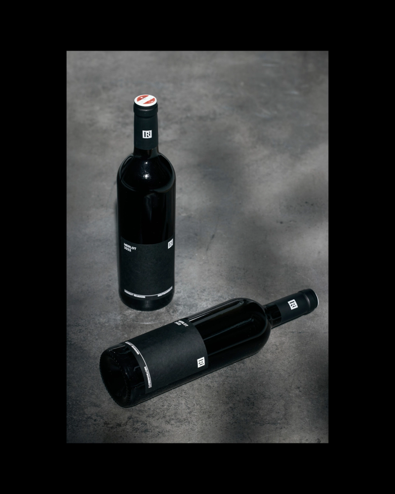
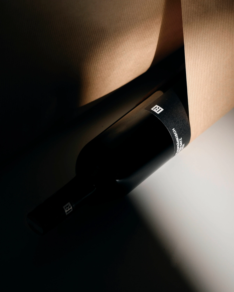
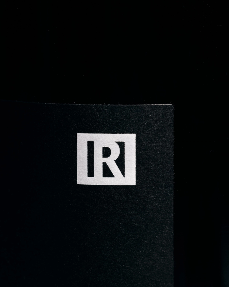
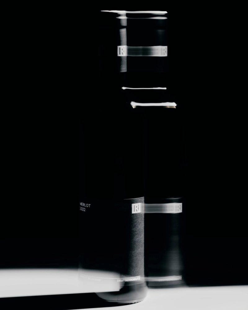
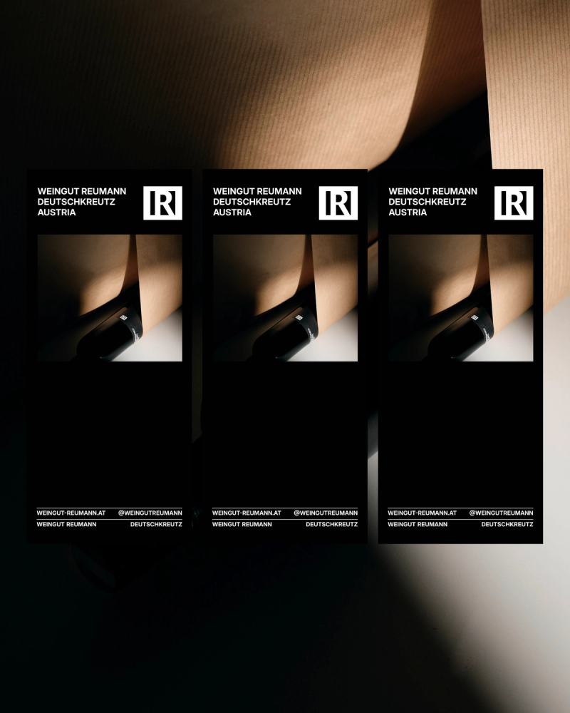
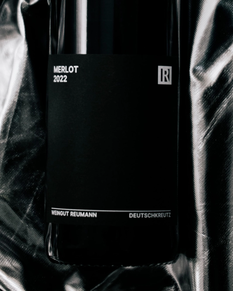
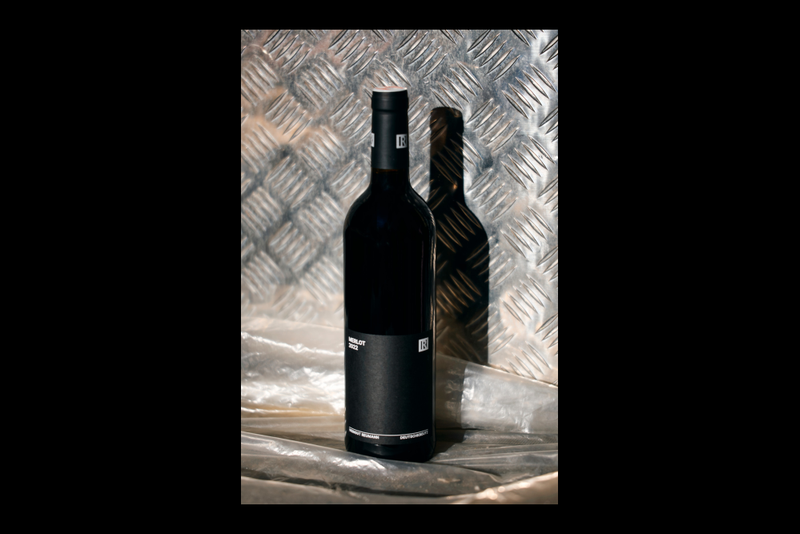
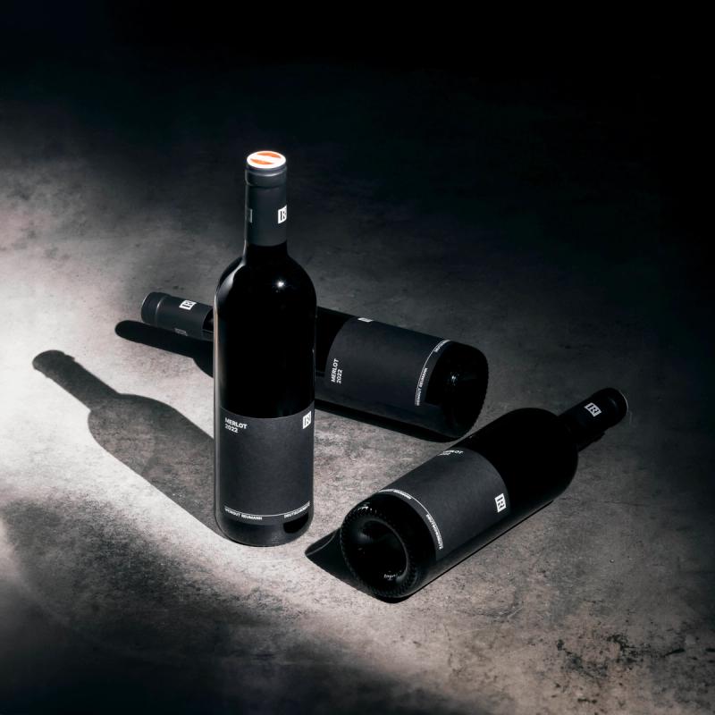
The new corporate and packaging design, initiated by the next generation, V+F, and developed in collaboration with the entire family, builds upon the distinguished roots of Weingut Reumann while incorporating a new aesthetic. Retaining the iconic R emblem, the redesign focuses on a refined black-and-white scheme with premium label materials: black-dyed paper and white foil. The updated layout with generous white space and typography ensures a timeless appeal, allowing the labels to integrate seamlessly into any wine collection, reflecting both tradition and contemporary design.
- Area of work:
- Corporate Design
- Packaging Design
- Client: Weingut Reumann
- Photography: C43